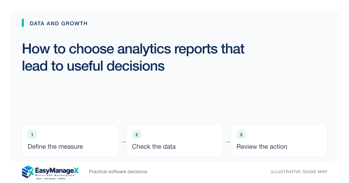
Choose analytics reports by starting with a decision someone must make, then define the evidence, metric and review cadence needed for it. Make each measure reproducible and expose relevant exceptions. A dashboard is useful when its owner can explain the number and act on it; more charts do not automatically improve understanding or operational control.
- Tie each report to a decision and owner.
- Publish definitions and reporting boundaries with metrics.
- Review the exception behind the number before acting.
Start with a decision inventory
Ask managers what they decide during routine reviews: replenish stock, reassign work, follow up overdue invoices or investigate delays. Write the decision and the information needed to make it. This prevents reporting work from starting with whatever fields happen to be easiest to chart.
Identify who acts when the measure crosses a meaningful condition. A report can have several readers, but an owner should be responsible for its definition and review. Without that responsibility, a warning can remain visible for weeks without producing a response.
Specify the measure before its appearance
Define the numerator, denominator, included records, date basis and exclusions. A completed-order measure may mean dispatch, delivery or accepted fulfilment. Choose the definition that fits the decision and explain it where readers can find it.
Keep the calculation separate from the visual design. A clear table can be more useful than a decorative chart when users need to inspect specific exceptions. Choose the presentation after you understand the comparison, grouping and action it should support.
Make filters and freshness visible
A report needs a period boundary and data freshness indicator appropriate to its purpose. Users should know whether they are viewing current operational records or a fixed review snapshot. Hidden filters can make two people discuss different populations while believing they share the same number.
Show material exclusions or missing inputs. If several branches have not submitted their records, label the scope instead of presenting an apparently complete total. This communicates uncertainty honestly and directs attention to the data collection issue.
Illustrative scenario: a late-order review
An illustrative distributor wants a weekly report to decide which customer orders need intervention. The team defines late against the latest accepted delivery commitment and excludes orders cancelled before that date. It retains lines that are only partially delivered.
The review lists the responsible owner and current blocker alongside the count. Managers can assign specific actions instead of debating whether dispatch should count as completion. The visual is simple because the important output is a prioritised set of unresolved customer commitments.
Inspect records behind unexpected changes
When a measure changes, inspect the underlying records and process context before drawing a conclusion. A new branch, import correction or changed definition can explain a shift without reflecting improved or worse performance. Keep the change visible in the review notes.
Separate monitoring from causal claims. A chart can show that two quantities changed together, but it does not establish why. Use operational evidence and appropriate analysis before attributing an outcome to a policy, campaign or tool.
Evaluate repeatability and access
Ask a candidate implementation to reproduce a report from exported rows using its documented definition. Test whether filters, permissions and late corrections affect the result as expected. Review access to detailed records as well as the dashboard summary.
Review the report with its intended action owner and ask what decision changes when the number changes. Confirm that underlying rows, definitions and refresh boundaries support the answer. If nobody can identify a useful response, refine the question before adding another chart or requesting more elaborate visual presentation.
Your working checklist
- List decisions each report supports.
- Assign definition and review owners.
- Write numerator, denominator and exclusions.
- Display period and freshness clearly.
- Add an actionable exception view.
- Reproduce one report from its rows.
Common questions
How many dashboard metrics should a small team start with?+
Start with the measures needed for a few recurring decisions and add others only when they serve an identifiable purpose. Each metric creates a definition, maintenance and review obligation. A smaller set that people can explain and use is more valuable than a broad dashboard that nobody owns.
Why do two reports show different totals?+
Check their date basis, filters, status definitions, included records and refresh timing before assuming an error. They may measure different populations legitimately. Document those differences and compare the underlying records. If they are intended to represent the same measure, assign an owner to reconcile the definitions.
Can a dashboard prove a process change caused improvement?+
A dashboard alone usually cannot establish causation. Changes may reflect volume, mix, seasonality, record corrections or other influences. Use the chart as a prompt for investigation and examine appropriate evidence before attributing an outcome. State uncertainty rather than presenting an unsupported explanation as a fact.
Sources and further reading
These primary references explain relevant concepts. Our scenarios and working checklists are original, illustrative guidance.
- IBM: What is enterprise resource planning?
Background on shared business data and operational decision support.
Published by EasyManageX as practical, AI-assisted guidance. Examples are illustrative. Confirm software capabilities, licence terms and project-specific requirements before committing. Read our editorial policy.